GOR’KA – a beauty brand people remember

Beauty and Care

|

ukraine

|

2025

About the project

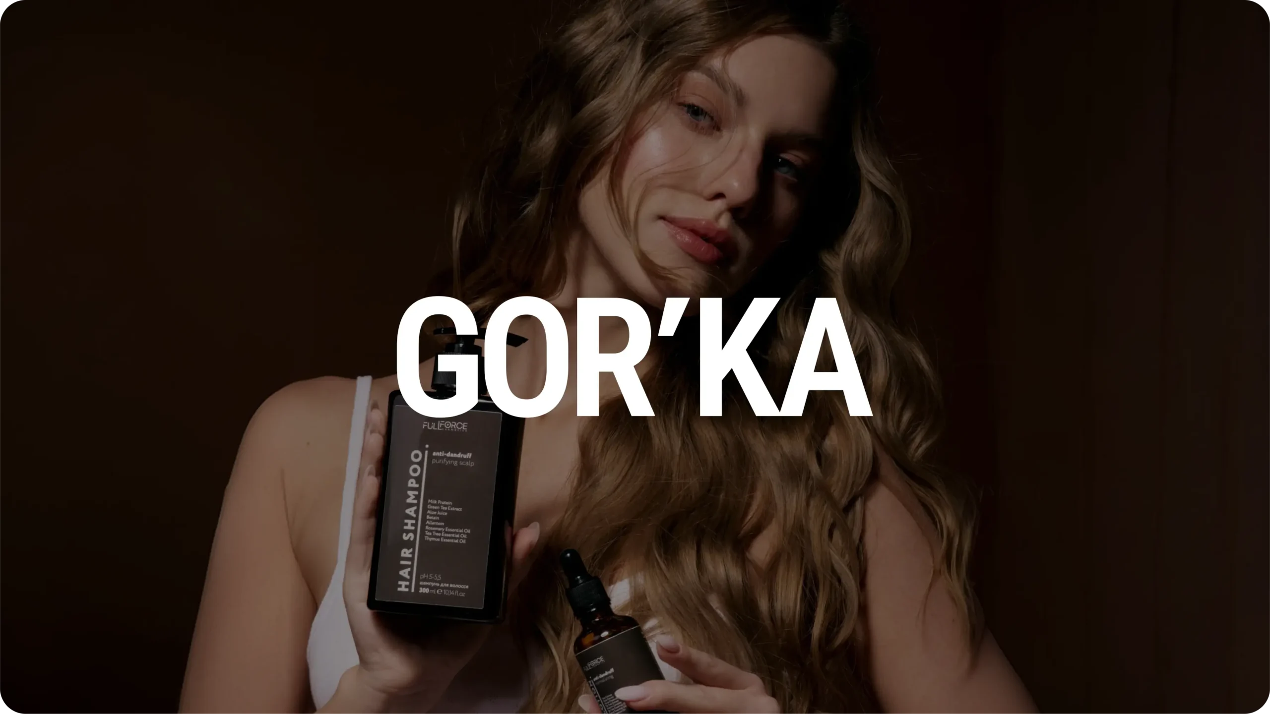
GOR'KA is project, where we supported the business from the earliest strategic decisions to a complete, scalable brand system.

Our team developed the brand identity, e-commerce platform, SEO strategy, advertising assets, photo and video production, as well as the brand's digital communications. None of these elements were created in isolation - they were designed as interconnected parts of a single system.

Our objective was never just to create a beautiful brand. We set out to build an identity that inspires trust, reinforces expertise, and gives the business a solid foundation for sustainable growth.
User-Centred Design Process

01Discovery Research
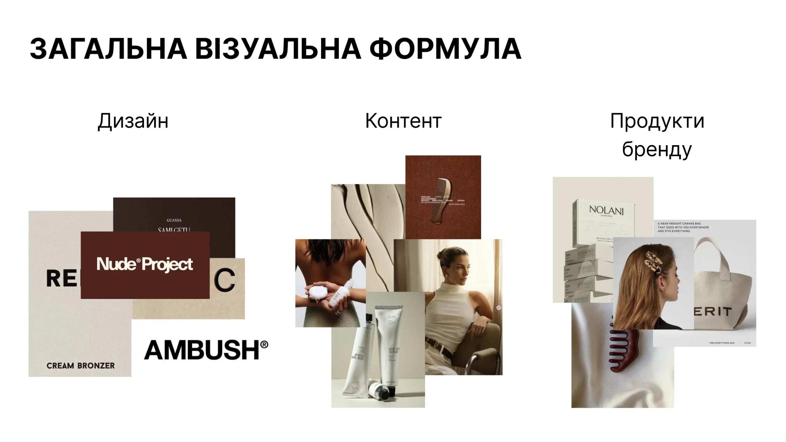
Through an extensive exploration of visual references, typography, color palettes, and composition, we refined the creative direction until a clear visual language emerged – one that balances medical credibility with contemporary beauty aesthetics while remaining timeless, elegant, and approachable.

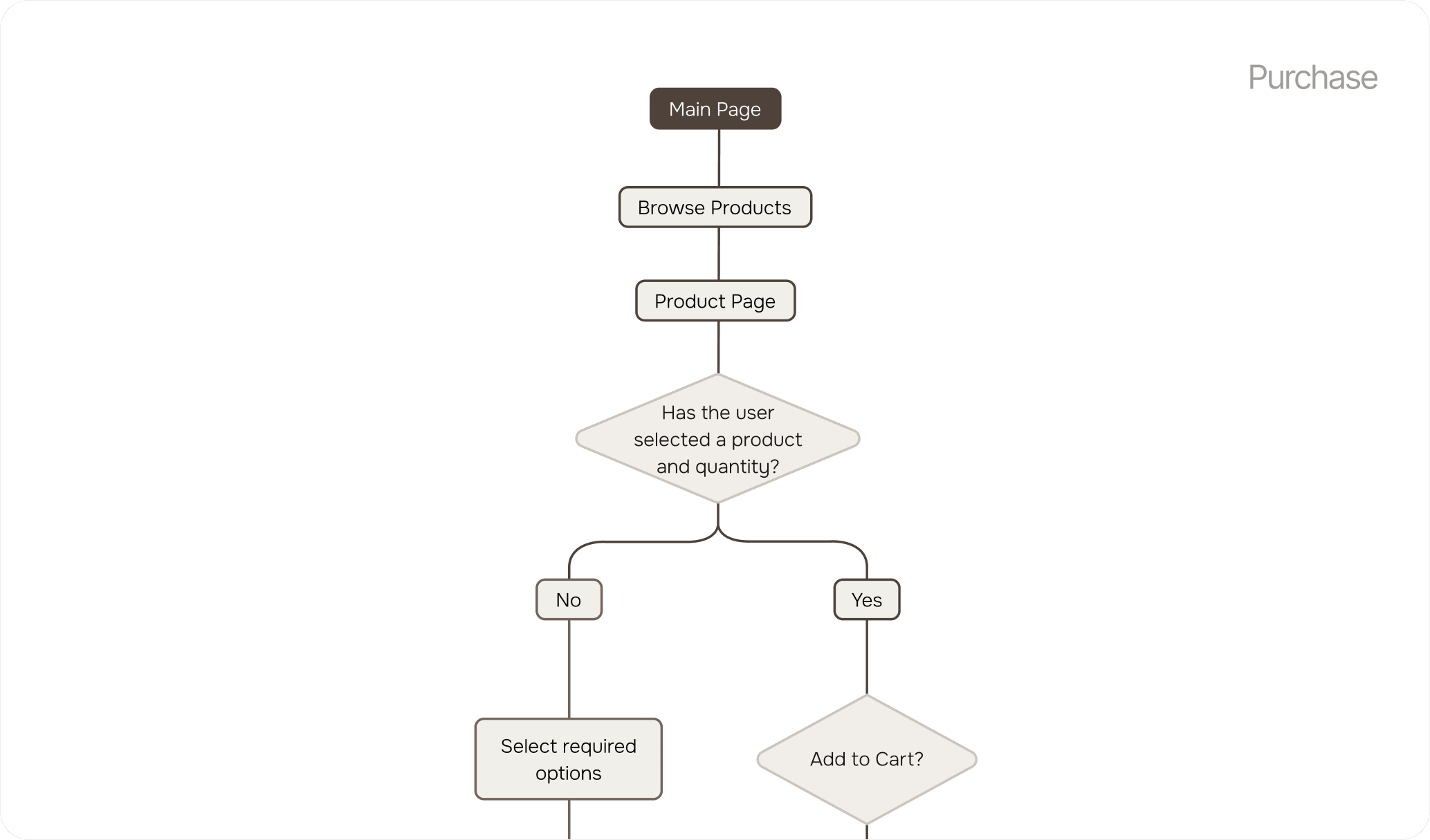
The result is a modern eCommerce store featuring an engaging homepage, intuitive navigation, well-organised product pages, and a visually consistent interface that makes browsing effortless and enjoyable.

A streamlined checkout, powerful product filtering, responsive layouts, and performance-focused development create a fast, frictionless shopping experience across all devices, providing a scalable foundation for future growth.
Results

The result is a modern eCommerce store featuring an engaging homepage, intuitive navigation, well-organised product pages, and a visually consistent interface that makes browsing effortless and enjoyable.

A streamlined checkout, powerful product filtering, responsive layouts, and performance-focused development create a fast, frictionless shopping experience across all devices, providing a scalable foundation for future growth.
Personal Account

Designed for effortless account management A clean and intuitive personal account was designed to give users quick access to their orders, saved addresses, account details, and profile settings.

Clear navigation and a well-structured interface make managing purchases simple and efficient.

From Strategy
to a Brand Language.

For us, design is never an isolated creative exercise. It is the natural outcome of strategy.

Every decision – from the smallest visual detail to the overall brand experience – was guided by research, purpose, and long-term scalability.

01Brand Discovery
Through an extensive exploration of visual references, typography, color palettes, and composition, we refined the creative direction until a clear visual language emerged – one that balances medical credibility with contemporary beauty aesthetics while remaining timeless, elegant, and approachable.

Results

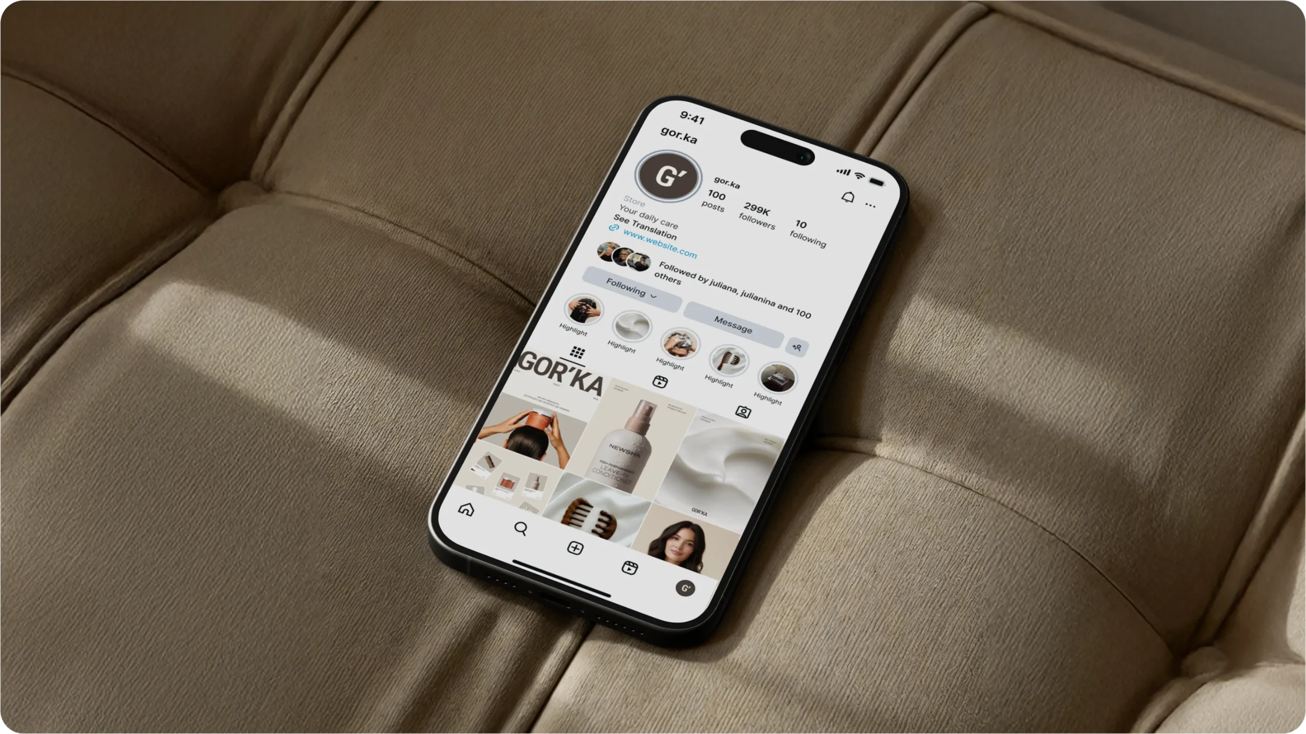
The outcome of this project extends far beyond a new visual identity. GOR’KA received a complete brand ecosystem where every touchpoint works together to create a consistent customer experience.

From the first impression on social media to the moment a customer opens the product packaging, every interaction reinforces the same values – professionalism, trust, quality, and care.

By combining strategy, branding, digital experience, content production, and marketing into one unified system, we created a foundation that allows the brand to grow confidently while remaining instantly recognizable.

Colors &
Typography

A strong identity is built through consistency rather than complexity.

For GOR’KA, we developed a visual system where color, typography, spacing, and composition work together as a single language. Every decision was intentional—creating a brand experience that feels calm, premium, and unmistakably recognizable.

The result is a flexible design system that adapts naturally across physical and digital environments while preserving the brand’s distinctive character.

AaBbCcDdEeFfGgHhIi
JjKkLlMmNnOoPpQq
RrSsTtUuVvWwxYyZz
1234567890

Roboto Condensed
Semi Bold

Це сучасний шрифт із чітким ритмом і впевненою геометрією. Він мінімалістичний, але не холодний
— у ньому відчувається структурованість, дисципліна й стримана енергія. Такий шрифт добре передає відчуття сучасності та довіри. У ньому немає зайвих деталей, лише ясність, баланс і точність.

aa

AaBbCcDdEeFfGgHh
IiJjKkLlMmNnOoPpQq
RrSsTtUuVvWwxYyZz
1234567890

Onest
Regular
Medium
Semi Bold

Це м’який, дружній санс-серіф із сучасним характером. У ньому поєднуються простота й людяність: округлі форми створюють відчуття тепла й відкритості, а чітка структура — впевненість і професійність. Цей шрифт виглядає чисто й гармонійно, легко читається та передає атмосферу довіри, чесності й спокою.

aa

Packaging

Packaging became one of the most important expressions of the GOR’KA brand.

Our goal was to create a system that feels premium without becoming overly decorative—clean, confident, and immediately recognizable on the shelf. Every label, layout, and graphic element follows the same visual principles established within the brand identity, ensuring consistency across the entire product range.

More than simply protecting the product, the packaging communicates quality, professionalism, and attention to detail before a customer even experiences what’s inside.

Logo

The GOR’KA logo was designed to express confidence through simplicity. Rather than relying on decorative elements, we focused on clean geometry, balanced proportions, and a distinctive silhouette that remains recognizable across every application.

Its restrained character reflects the brand’s professional expertise while maintaining the elegance expected from a premium beauty company.

Whether placed on packaging, digital interfaces, printed materials, or environmental graphics, the logo performs consistently and confidently at every scale.

What the Client Received

Rather than delivering isolated creative assets, we built a complete ecosystem that supports the brand at every stage of its development.

The project included brand strategy, visual identity, packaging design, e-commerce website, SEO optimization, content production, advertising materials, photography, video production, and social media design—all developed as parts of one cohesive system.

By approaching every touchpoint through a unified strategy, GOR’KA received more than a collection of deliverables. It received a brand foundation designed for long-term growth, stronger recognition, and a consistent customer experience across every channel.

"They became part of our team, not just a vendor. Went from $0 to $180K MRR in eight months. Wouldn't have happened without them."

Mark T.

B2B SaaS · Austin
Project Team

Project Lead — Vladyslav Trusov


Creative Director — Bogdan Voyt

Brand Strategy & Design — Volovodenko Polina

Project Manager — Trusov Vladyslav

Ready to be our next success story?

Frequently Asked Questions.

Still have a question?

Get in touch and we’ll respond shortly and help you find the right solution.

How do we get started?

We begin with a brief or an initial call to understand your goals, then provide a tailored proposal and project plan.

Get in touch and we’ll respond shortly and help you find the rigWe begin with a brief or an initial call to understand your goals, then provide a tailored proposal and project plan.We don't use fixed packages because every business is different. Instead, we study your business’s current state of online presence, niche, and goals, then propose what fits the best. You decide whether to go ahead from there. If you'd like to see some real numbers first, take a look at [pricing examples

On average, six months or more before you see real results. That's typical for SEO across most industries. But it depends on the current online presence, competition, niche, and past work. Some of our clients hit full ROI in just five months, so it really varies.

You'll see a wide range of metrics. These include organic search, your priority keyword rankings, visits, and AI results, among others. Reports are detailed so that you can see nearly everything.

We understand how AI search picks its sources, and we optimize for that. We do this without hurting content quality or making it dull for real readers. Balancing both requires skill, and that's what we're good at.

We understand how AI search picks its sources, and we optimize for that. We do this without hurting content quality or making it dull for real readers. Balancing both requires skill, and that's what we're good at.

Still have a question?

Get in touch and we’ll respond shortly and help you find the right solution.

Other Successful Projects

Wozyk

Brand Identity | Website Development

Shark RAW

Brand Identity | Website Development

GOR'KA

Brand Identity | Website Development

Ready to work 
with an agency that gets it?

Let's spend 30 minutes together — no pitch, no pressure, just a real conversation about your growth. Walk away with a clear strategy whether you hire us or not.